6 mins
OpenImage formats explained: When to use different image file types
5 mins
Don’t get lost in fancy flourishes during you website redesign. Make sure you know the do’s, the don’ts and what to expect from this process, so your new site can be delivered on time!
3rd February 2016

When we know what constitutes a meaningful visit to your site and how you want users to interact with it, we’re in the best possible place to help you create an effective experience for your audience.
Whether you’re getting an entirely new website built or giving your old one a makeover, being part of the web design process can be both exciting and rewarding.
Web design is a place where visual communication meets verbal, where brand and experience merge and where the latest technology is constantly pushing boundaries.
But with all this going on, there is also a the risk of miscommunication and of differences of opinion causing conflict, of getting distracted by fancy flourishes, or of growing frustrated with the limitations of a particular platform.
To help you and your chosen design team (whether that’s with an agency like us or an inhouse team) navigate these challenges, we’ve put together a handy little guide for clients that we think will help you communicate your ideas clearly and will give you an idea of what to expect as you go into this process.
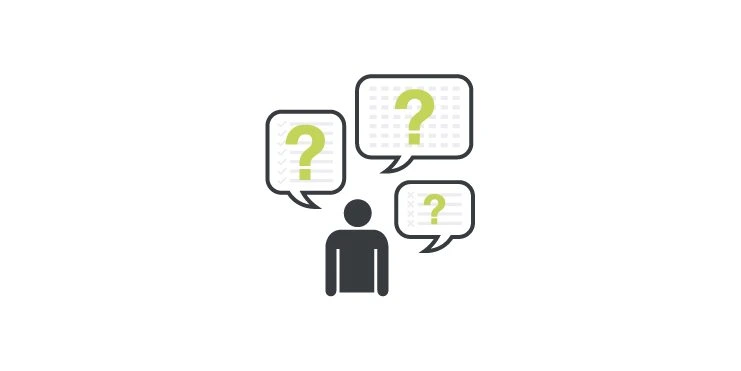
Whilst your website needs to look great, it’s more important that it works for your business.
That’s why we want you to start by telling us about your website’s aims, who your target audience is and what your brand’s position in the market is. Will you be selling online or is this more of a storefront for your business? What is your demographic? How are you currently getting most of your sales?
When we know what constitutes a meaningful visit to your site and how you want users to interact with it, we’re in the best possible place to help you create an effective experience for your audience.
Remember, not every visit will immediately convert to a sale, so it helps to think about what you want your audience to see and experience on their first engagement with your site, on their second visit, their third even, and then share with us how you envision users getting in touch.
Does your company have brand guidelines on colours and logo use? Do you have a database of images we can use?
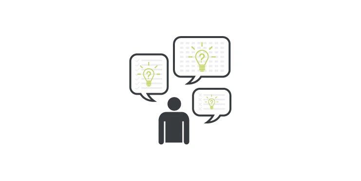
Designers love to get practical. Once you’ve communicated the the basic intention of your site, it’s time for all the details and lots of examples. This helps us eliminate misunderstandings early and will help us work out a solid estimate.
First, the competition. We often ask clients to put together a list of competitors and then tell us what they like about these competing, what they would like their own site to do better and where their brand or services’ own unique selling point is.
Now it’s time to talk about the tone of your brand and the look and feel of your site. We encourage clients to put together a list of websites, palettes, design features, functionalities, typefaces and photographs that they think will work for their site.
This could be contained in a simple document with screenshots, descriptions and the web addresses of the sites you are referring to. Or you could use a platform like Trello (with lists for elements and cards for each design idea). Or if you’re more familiar, you can even use Pinterest. (Open a private board that you can share with us later.)
Does your company have brand guidelines on colours and logo use? Do you have a database of images we can use? Are there high resolution files of your brand identity that we can have access to? Now is the time to tell us about that too.
It’s unlikely that your design team will use all of these ideas, but it will give them a really good idea of the kind of design “language” you would like your brand to speak. In fact, it’s the job of a good design team to help you shed any unnecessary clutter – selecting the strong points of your vision and working with those.
It’s helpful to keep in mind that sheer quantity doesn’t win over quality and that more is not necessarily better.
If you can, also try to have some of your website content ready (even if it’s just a rough draft) to start the design process off with. It helps to prioritise information and test out different hierarchies and styles.
It’s helpful to keep in mind that sheer quantity doesn’t win over quality and that more is not necessarily better.
Before we all start dreaming too big, it helps to talk about the boundaries of your project.
Discussing the budget and timeline for your project will help your design team work out how to use your resources to best effect.
A smaller budget might, for instance, mean doing away with additional functionality (the coding and testing of which can take time) or a tight deadline might mean buying quality stock images to use in the interim whilst you arrange a photoshoot. Tell us beforehand so we’re all on the same page and can find the best way to get your website done on time and within budget.
With careful planning and open communication about what is possible and practical (and what isn’t) a smaller budget does not have a to mean a smaller impact.
But website design is not only limited by budget and timelines. The particular platform you’re using and the limitations of web design itself will mean there are some things that are simply not practical, cost effective or even possible at all.
It’s important to keep an open mind and let your design team guide you. That’s why we also encourage you to do a lot of this:
With careful planning and open communication about what is possible and practical (and what isn’t) a smaller budget does not have a to mean a smaller impact.
Web design pulls together people from different areas of expertise. You’ll know the ins and outs of your industry intimately and be able to provide insights the design team couldn’t possibly possess.
Equally, you’ll be working with a group of designers who, through many projects, have learned the most effective ways of communicating information online and who will have developed a reliable instinct of what works and what might not.
Developers bring another layer of experience and are incredibly resourceful, advising on website functionality and cautioning against out-dated approaches.
The result is that web design is always a dynamic process – with original plans requiring adaptation to fit experience and technical scope.
In short, a website project almost never ends up exactly how it was planned – but if you’re working with a good team and know how to communicate effectively, it will turn out better.
To achieve this it’s crucial that a) no one makes any assumptions, and b) everyone tries to understand the limitations and motivations behind decisions.
The one magic word we encourage our clients to use here is: WHY?
Asking “why” not only helps you better understand the creative and technical decisions that inform your website design, but it also cultivates an atmosphere of open communication and consultation between you and your team:
Oh, so you’ve decided to go against inserting icons in the mobile menu. Why?
Well, we’ve realised that though quirky, icons are difficult to style for a number of screen widths and for some users might actually negatively influence the browser’s experience. Getting this entirely right will take a lot of development time and we’d much rather use that to test and refine your contact forms.
Much like a home renovation, no website is every really “finished”. Technology changes, information requires updating, there’s always a place that needs a touch of paint or a creaky hinge that requires a bit of oil.
Remembering this will help you take a step back from the project and prevent you getting caught up in the details. Think of your site in phases and plan going live once the first phase is complete. That way smaller adjustments don’t hold back the process – you can always do those later.
Not racing frantically towards achieving absolutely perfection in record time will also help you enjoy the creative process that much more.