7 mins
OpenCan Instagram Be Used To Boost SEO Strategies?
5 mins
Social Media is a constantly evolving tool in marketing, both online and offline. Businesses need to be smart, careful and savvy when selecting where to place icons for different social media platforms.
23rd May 2016

Here there is one cardinal rule: The whole point of these icons is to be instantly recognised and then facilitate effortless engagement.
Social Media is a constantly evolving tool in marketing, both online and offline. But with the changing versions, uses and audiences, businesses need to be smart, careful and savvy when selecting where to place icons for different social media platforms.
Here there is one cardinal rule: The whole point of these icons is to be instantly recognised and then facilitate effortless engagement. This means best placement will differ across mediums and is informed by your intentions. Knowing how you want users to interact with the icons is key to understanding how to use them.
With advice from our design department and using the best practices for SEO and UX, here are our top tips for placement of social media icons for maximum engagement.
Linking to your social media content within the copy on your site is a different and potentially powerful way of boosting engagement. This can be done within blogs or general copy, but should always only be added in a way that’s beneficial to your readers.
Share buttons around blogs or news pieces is a great way to attract users to engage. Some share buttons also include counters, which should only be used if your posts get a lot of interaction. Otherwise, it’ll have a negative effect on users.
You can now share quotes directly to Facebook or Twitter using unique functions. By building share quote functionality into your content, especially key sections or phrases, you are creating a quick click CTA for users. This in turn will boost your social interactions.
 Automatic suggestions to share can be coded in.
We love to share images. The digital space is increasingly being dominated by images and videos and users love it. Pinterest, as a social media platform, is proof of this, boasting over 100 million active users.
Users with plugins can share content to sites like Pinterest, but you can help encourage them to do so by including social media icons on and around images. This could be as a hover over or a ‘Share’ button.
Because the header and footer are the same on every page, “framing” your site, they are great place to include information you want to remind users of – such as your brand name or key contact details.
The header is a busy space, where you want to see clear navigational signposts, i.e. the key services or products for a business. Adding social media icons here would look to bulky.
Where you’ll often see social icons is in the footer of a website. Alongside other contact details, like phone numbers and email addresses, social media icons are grouped here are reminders of the different possible touch-points for your brand on the web.
Adding icons in footers is easy, and the icons can be edited into your brand colours. Here, you want to icons to be visible, and clickable, but they aren’t the biggest Call-To-Action (CTA).
The header is a busy space, where you want to see clear navigational signposts, i.e. the key services or products for a business. Adding social media icons here would look to bulky.
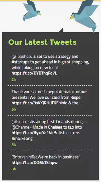
What catches your eye most on a web page? Movement. Motion is one of the most engaging tools in web design, be it effects in hover overs or built-in videos. For social media, it’s live feeds from your social channels.
Site UX is greatly improved by visuals, motions and, specifically, the ability to interact with said movement. A live social media feed provides all three. On home pages and news or blog sections, social media feeds can be used to encourage interaction with your social media accounts, while also teasing some of the content that you are sharing. The social media icon heading the feed will also create a direct connection in the user’s mind between your brand and that platform.
 Feeds can be customised to your house style.
Place select social media feeds in a sidebar box, but beware of overfilling your page with ALL your social media accounts. Select only those you most regularly update, such as Twitter, Facebook or LinkedIn. You can also include a Call-To-Action here, such as “Follow Us” or “Like Us”. This is a great way to get more followers – so make it easy for visitors to add you directly via the feed.
Pop-ups, despite not being the most popular advertising tool from a user perspective, are still popular. Typically they launch after a minute or two on a site, asking the user to interact with it. The problem with pop-ups is that they can feel invasive.
Be cautious when considering adding pops up to promote your social media as it could put users off your site. If you do use this method, make sure they aren’t appearing as soon as a user lands on your site, otherwise they’ll be likely to bounce straight out.
Google and users are thinking Mobile First in 2016. But as users are tending more towards devices with screens smaller than desktops, icons or sidebar feeds can take up valuable and limited space.
Your social media platforms are not likely to be the MOST important information for users – those would be your products or services. Being selective about how you add icons to certain pages of your site will help boost engagement.
Be aware of meaning changes on social media – like when Twitter changed the “Favourites star” to “Like hearts”
Articles (like news items or blogs) as well as guides offer the chance to use share icons for your social media platforms. Adding these (with or without share counters) to the top and bottom of posts won’t take up much room and can help to drive traffic from your site to those platforms.
Note: Only include the share numbers if you are getting frequent interaction, otherwise your content will be signposted as “not interesting”.
Revise and renew social media icons regularly. Social media is not a static medium. It requires daily attention and frequent updates to keep user attention and engagement. In order to reap maximum benefit from your social media choices, you’ll need to have a strategy that ensures your social media changes your site is keeping up with the correct use of their icons.
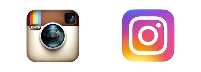
 Old Logo (Left) Vs New Logo (Right)
Take a look around the web and you’ll easily spot which sites are using the latest versions of social media icons. This will be all the more obvious for some sites since Instagram overhauled their logo this month (May, 2016). With more than 75 million users daily, most brands understand that being on Instagram is a necessity not a nice-to-have. But not all will be equally quick to update to the new logo.
In the coming months, when users see sites with the old logo, they’ll see familiarity. But if you upgrade to the new logo, they’ll take notice even more. The new logo stands out against the others in bright colours, it also suggests that your brand keeps up to date with social media and that it is being revamped regularly. These are clear signs of an engagement worthy brand.
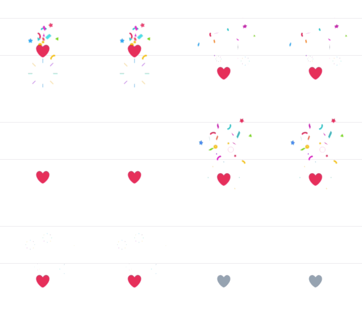
 New Twitter Hearts
The same rules apply to meaning on social media sites too: like when Twitter changed the “Favourites star” to “Like hearts”. Their reasoning was based on changing the meaning of the interaction, making it more in line with platforms like Tumblr – who have used the heart for years to show appreciation and agreement.
If before the update you’ve asked users in your social media campaigns to “favourite”, you’d of course now need to change that to “like”, otherwise you risk appearing nonsensical and outdated. These larger changes are rarer than smaller algorithm or style updates. But do keep track of smaller changes just in case and be prepared to make updates when there are bigger overhauls.
The Pinterest plugin for desktop browsers is a popular and useful tool for frequent pinners. With the plugin installed, they can instantly pin articles, images and items from across the web to their custom boards – crucially without having to switch window or log in. This can also be done on mobile via linked apps.
However, the plugin interacts with pinnable items by superimposing the Pinterest logo on images in the centre. As this is typically where users would click to expand an image, it can create a functionality issue – especially on mobile. If you want your items to be pinnable, consider adding an “enlarge” button or symbol to the corner of images.