6 mins
OpenImage formats explained: When to use different image file types
8 mins
Accessibility should be a key consideration in every web design. Your website could be alienating a huge segment of the population if it doesn’t embrace user experience that’s accessible for all, particularly those with disabilities or using assistive technologies.
1st March 2021

The latest government figures show that there are over 11 million people in the UK alone living with some form of disability.
Here at Go Up, our trusty web design team prides itself on creating beautiful, functional websites that perform perfectly on all browsers and devices. However, they also know that the best websites provide an excellent user experience to each and every person that visits them, no matter who they are. How do they make sure that’s the case? That’s where web design accessibility comes in.
If this is a term you’ve heard of but know little about, keep reading. Accessibility is extremely important, and contrary to popular belief, it’s easy (and not that expensive) to implement. That’s why we’re here to teach you everything you need to know about accessibility in web design so you can apply it to your own site.
Web accessibility means that websites, tools, and technologies are designed and developed so that they can be easily used by people with disabilities. Everyone should be able to engage with the Internet, regardless of their condition or capabilities, and it’s a web designer’s job to remove any barriers that may result in a poor user experience for anyone.
Web accessibility also brings with it plenty of business benefits. For one, why wouldn’t you want your products and services to connect with as many people as possible? The latest government figures show that there are over 11 million people in the UK alone living with some form of disability. Without embracing web accessibility, your company could be alienating a huge segment of the population and you’ll miss out on many potential customers — especially if a competitor has made their website more user-friendly for all.
What’s more, this resource from the World Wide Web Consortium (W3C) highlights how accessibility can improve innovation, create a more positive brand image, and minimise legal risks where countries have specific digital accessibility standards. And there’s one more exciting advantage worth pointing out: better SEO. Google has its own official guidelines on accessibility and, unsurprisingly, the search engine tends to reward sites that follow them. After all, an accessible website is easy to navigate and understand. Tick both of these boxes and Google will have no trouble crawling it, which will then boost your chances of ranking well.
To improve the accessibility of your website, you first need to consider the range of users your site has to accommodate. As well as noting potential disabilities, it’s also important to think about the assistive technologies that people with these conditions may turn to when using the Internet, such as screen readers, speech recognition software, and alternative keyboards.
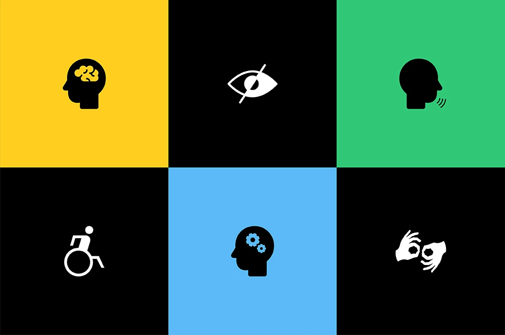
Generally, the most prevalent conditions can be divided into the following categories:
Involves some level of hearing loss. E.g. deafness and hearing impairments.
Also known as an ‘intellectual disability’ affecting general mental abilities. E.g. attention deficit disorder (ADD), autism, dementia, Down syndrome and dyslexia.
Google has its own official guidelines on accessibility and, unsurprisingly, the search engine tends to reward sites that follow them.
Disorders of the Central Nervous System impacting the efficiency of brain processes. E.g. Alzheimer’s, brain tumours, epilepsy, multiple sclerosis, Parkinson’s and strokes.
Conditions that affect a person’s mobility, physical capacity, stamina, or dexterity. E.g. amputation, arthritis, cerebral palsy, muscular dystrophy and spinal cord injuries.
Communication disorder where ‘normal’ speech is disrupted. E.g. apraxia, stuttering and voice disorders involving the larynx.
Also known as vision impairment or vision loss, where there is a decreased ability to see to a degree that is not fixable by usual means, such as glasses. E.g. Blindness, cataracts and glaucoma.
In a word: yes! Web accessibility really is good for everybody, because the aim is simply to make a site as user-friendly as possible. Aside from helping those with disabilities, many others will reap the benefits, including people:
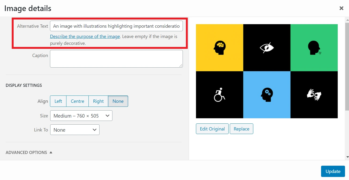
Alt attributes (also known as alt text/alt tags) provide additional text when an image cannot be seen. This means that someone using a screen reader will know what and where a picture is, as will a person using a device that can’t display the image for some reason.
Alt text should clearly describe what’s happening in an image so that users understand its meaning and function. It may not be necessary to do this for every image, especially if the surrounding text does enough to explain the content. In this case, you would have to add an empty <alt> attribute so that screen readers know to skip it. However, if you don’t write any alt text, a screen reader may read out the file name instead, which could create a very confusing experience.
 Alt text is used by screen readers to help those with visual impairments understand the contents of an image. The alt text is also used if a device is unable to show the image for one reason or another.
The aim is simply to make a site as user-friendly as possible. Aside from helping those with disabilities, many others will reap the benefits.
People with visual impairments may struggle to read content if the text and the background aren’t clearly distinguished. Implementing high colour contrast will make the words easier to comprehend, as long as they aren’t too bright, as this can cause eye fatigue. It’s also a good idea to use white space or borders, which can help users separate blocks of content.
There are plenty of reasons why a user would rely on a keyboard rather than a mouse to navigate a website, particularly for those with a motor disability. This usually involves using the Tab key to interact with things like links and buttons.
To provide a good user experience, each element must be presented in a logical, intuitive order — left to right, top to bottom. Test your own site using the Tab key, and if there are any parts of the site you can’t reach, this is a problem you’ll have to rectify.
Another tip is to keep your navigation as simple and streamlined as possible, so that users don’t have to spend much time tabbing through all the links. You could also consider having a link at the top of each page which skips to the main content.
Indicators show users when and where they need to take action. In terms of accessibility, it’s important not to rely on just one visual cue, such as colour. What if a potential customer is colour blind, for example?
Rather than simply making the text red to show an error, you could also add icons or additional text, and help links stand out by formatting them in bold or with an underline. This also applies to focus indicators, which allow people to see where exactly their mouse or keyboard cursor has landed on the site. When someone hovers over a link, for instance, it needs to look distinct compared to the other elements on the page.
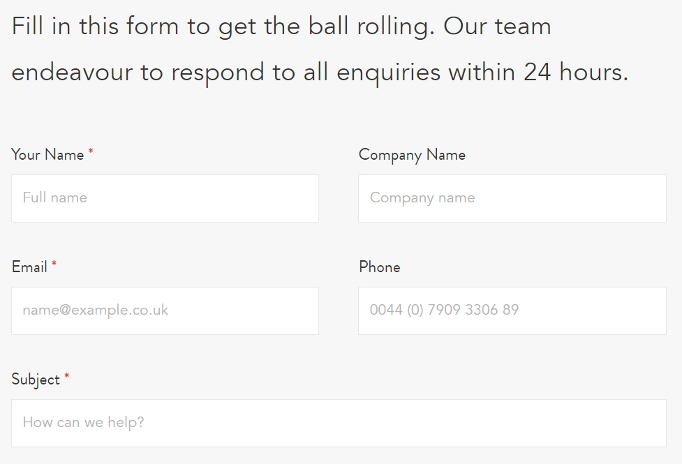
When designing a form, every field should be clearly labelled so users instantly understand what they need to write. For example, ‘your surname’ could be written in the box where their surname should go. Ambiguous place-holder text can be confusing, but you don’t want to overwhelm someone with a long instruction either. Simply provide the right amount of information for them to complete the task without any second-guessing.
 Ensure all forms have clear and simple labelling to guide users on what information should be included in each field.
Accessible web design must be consistent, so don’t chop and change common features across different pages.
Heading tags illustrate the hierarchy of content on a page so users can make sense of its order. The page title will be marked by an H1, followed by further subheadings — these could then be broken up into H2s and H3s, and may, in turn, be divided into H4s if necessary, but should always be used in numerical order. Incorporating headers gives your content a structure and flow that’s easy to digest, and will also help screen readers to interpret a page correctly.
Accessible web design must be consistent, so don’t chop and change common features across different pages. For example, the navigation should always look and function identically on every page. Also watch out for icons and symbols — if you have a telephone receiver as the ‘contact us’ icon on one page, don’t switch to an email graphic elsewhere, as it could risk confusing users and accessibility programs. That’s why here at Go Up, we create design systems prior to designing our websites. These document everything from heading styles and colour palettes to buttons and links, meaning that we can turn to this outline every step of the way to ensure designs are consistent across an entire website.
Subtitles are crucial for users who can’t access audio. These could either be captions that can be turned on and off, or subtitles that are hard-coded within the video file. Make sure the words are properly synchronised with the audio, or it will be distracting and the viewer may struggle to keep up.
 Always include subtitles on videos to ensure those with hearing impairments can follow the narrative with ease.
For the sake of people with limited vision, it’s always safest to present text in a clear font that is on the larger side. However, you can go a step further by allowing the words to be resized depending on the device or browser. This works best when the text is scaled according to other content and the size of the screen in question, rather than specifying text size using pixels. To achieve this, you’ll need the help of a professional web designer or developer to see whether your site can support this feature.
Enabling autoplay on media like videos and music is generally not advised. For starters, let’s face it — it’s pretty annoying! But this is 100% a no-no when designing an accessible website. As well as potentially confusing or frightening users with these sudden outbursts, assistive technologies also can find it hard to turn these things off. The same goes for automatic navigation options, like carousels and sliders, as the content could easily move on before the user has absorbed all the information. Eliminate these frustrations by allowing every user to have total control over how they engage with your site.
For the sake of people with limited vision, it’s always safest to present text in a clear font that is on the larger side.
Examine the Web Content Accessibility Guidelines (WCAG) which are organised into three levels of conformance:
The Lighthouse tool offers accessibility scoring with clear passes or fails — a page doesn’t get points for partially passing an accessibility audit. For example, if some buttons have accessible names but others don’t, the page gets a zero for the accessible buttons audit.
An accessibility group at Home Office Digital has created these dos and don’ts posters for anyone approaching the issue from a design perspective. Currently, there are six different posters, which cover:
The axe Coconut Google Chrome Extension tests any site for accessibility violations using the Chrome inspector.
We’ve shown you how much web accessibility matters, and perhaps you’ve already identified some areas where your own website is currently falling short. So, how do you start putting things right?
The first thing you need to do is have your code audited by a professional developer who is familiar with the most up-to-date best practices around web accessibility. They’ll be able to find any areas in your code where key accessibility features are missing and can fix them accordingly.
Going forward, you also need to keep accessibility at the forefront of your mind when publishing new content or making design changes, and you may wish to talk things through with a professional web designer to see if there’s something you’re overlooking. There’s probably always an extra step you can take to make your product even more accessible, and when your website is designed with everyone’s needs in mind, all of your customers will get the user experience they deserve.